A Tale of Four Components

Republished with permission from Bendyworks.
There is more than one way to write a web component. You can build a component from scratch or you can rely on one of a growing number of web component libraries. Libraries are great: they handle both the dullest and the trickiest parts, protecting you from boilerplate code and edge-case errors. But they also increase your component size and sometimes make testing more difficult.
To explore the options, this tutorial will create a web component from scratch and then recreate it with three libraries: Nutmeg, Polymer, and Stencil. All of these are good options, but they come with different trade-offs. Read on to find which approach best suits your style and needs.
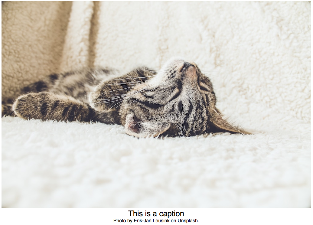
A Better Image
We will make a simple component, which we'll call better-img, that adds a fallback url, an error-logging function, and a caption to an image. In addition to the standard image attributes (width, height, alt), the component will take three custom attributes: url, a required attribute that identifies the image to display, fallback, the url for a backup image to display in case of an error, and log, the name of a method that will be called whenever the fallback image gets displayed. The log attribute allows component users to tell their server about image errors so that the errors can be tracked down and fixed.
In addition, the component will display text or html (or even another component) below the image as a caption. Here's an example of what it could look like in the HTML and on the screen:
<better-img
  url="img/sleeping-cat.jpg"
  fallback="http://placehold.it/800x533"
  log="logMe"
  alt="a sleeping cat">
    <div class="caption-primary">This is a caption.</div>
    <div class="caption-secondary">
      Photo by Erik-Jan Leusink on Unsplash.
    </div>
</better-img>
Note: Unlike <img /> tags, custom elements cannot be self-closing.
Defining the Component
Our first step is to define the component. In standard JavaScript, we do that using the Custom Element API. Custom elements are a fairly new web standard and form the basis of web components. (Web components often rely on other standards too, including Shadow DOM and HTML Templates, but none of these are necessary.) Custom elements are supported in Chrome, Safari, and Opera. In Firefox, they are behind a flag and in Edge support for custom elements is on the way. You can use a polyfill to support all modern browsers.
To define a custom element, register the element with a tag name and an ES6 class. The snippet below tells the bowser that when it encounters the better-img tag, it should delegate control to the BetterImg class.
class BetterImg extends HTMLElement { ... }
window.customElements.define('better-img', BetterImg);
Note: Custom elements must have at least one hyphen in their names so that browsers can distinguish them from built-in elements.
The BetterImg class inherits from HTMLElement, which means that our custom element gets all the properties and methods that any other element gets: classList, tagName, querySelector(), addEventListener(), and so on. In theory, the BetterImg class could inherit from the more specific HTMLImageElement. The Custom Element spec describes this as customizing built-in elements, in contrast to creating "autonomous" custom elements. Because customized built-in elements are not as widely supported, we will stick with an autonomous element.
When you define a component using one of the web component libraries, the component will inherit from the library's custom element base class. In the case of Nutmeg and Polymer, the code is almost identical to the vanilla JS. Nutmeg elements inherit from the Seed class and Polymer elements from PolymerElement.
// Nutmeg
import { Seed } from "@nutmeg/seed";
export class BetterImg extends Seed { ... }
window.customElements.define("better-img", BetterImg);

// Polymer
import { PolymerElement } from "@polymer/polymer/polymer-element.js";
class BetterImg extends PolymerElement { ... }
window.customElements.define("better-img", BetterImg);
These base classes parse complex attribute values, watch for property changes, keep properties and attributes in sync, and perform other useful tasks.
Stencil accomplishes the same things, but it is organized somewhat differently. Instead of using customElements.define, Stencil uses a @Component decorator to declare the name of the tag, while separate @Prop, @Watch, and @State decorators handle properties, attributes, and events.
// Stencil
import { Component } from "@stencil/core";
@Component({
  tag: "better-img"
})
export class BetterImg { ... }
It's also worth mentioning that Nutmeg and Stencil use TypeScript by default while Polymer uses JavaScript.
Testing
At this point, we are ready to write our first test. We know that the component should display an image, so let's test that an image gets displayed.
describe("<better-img>", () => {
  let component, img;
  beforeEach(() => {
    component = fixture("<better-img></better-img>");
    img = component.shadowRoot.querySelector("img");
  });
  it("renders an image", () => {
    expect(img).to.be.ok;
  });
});
This test uses Mocha, Chai, and Karma. (You can see the whole setup in the GitHub repository.) It asserts that an img tag will be present in the component's shadow DOM.
A brief aside about Shadow DOM
The shadow DOM isolates our component's code from the rest of the page's HTML, CSS, and JavaScript. This means that our component's style is scoped to the component. Any style rules defined in our component will have no effect on the parent page, and most of the styles on the parent page will not affect the component. An exception is style applied to the page's body, html, or * selectors. The component will inherit those styles (as long as none of the component's styles override them).
Back to testing
Each of the web component libraries ships with testing tools and a starter test suite. Tests of the better-img component built with Nutmeg (here) are almost the same as above, but with some adjustments for TypeScript. Polymer uses its own web component tester, which also relies on Mocha and Chai. Unfortunately, Polymer tests do not yet work on Node 10. You can see the tests for the Polymer version of better-img here. Stencil tests use Jest. Stencil tests also have a limitation; as of this writing, they do not work with Shadow DOM. (See this issue for the latest information.)
// Stencil
describe("rendering an image", () => {
  beforeEach(async () => {
    let testWindow: TestWindow = new TestWindow();
    let element: HTMLBetterImgElement = await testWindow.load({
      components: [BetterImg],
      html: "<better-img></better-img>"
  });

  it("should render an image", () => {
    expect(element.querySelector("img")).toBeTruthy;
  });
});
You can see the full Stencil test suite here.
This test we have written will fail because the component does not do anything yet. To get the test to pass, we need to display an image, and we will do with with an HTML template.
Templating
HTML templates are the preferred way to create a component's DOM content and are supported in all modern browsers. For better-img, we will create a template using JavaScript template literals in a static getter.
class BetterImg extends HTMLElement {
  static get template() {
    const template = document.createElement("template");
    template.innerHTML = `
      <style>:host { display: block; }</style>
      <img />
      <slot id="caption"></slot>
    `;
    return template;
  }
}
If you prefer, you could create your template in HTML with a <template> tag. Either way, you should use a template rather than adding innerHTML directly to your component. While the browser will parse the template only once, it will parse the innerHTML for every instance of your component.
A brief aside about slots
You will notice that our template contains a <slot> element. A slot creates an opening in the shadow DOM, a bit of DOM that is not isolated from the rest of the page. If you include a slot in your shadow DOM, the users of your component can put whatever they want in it, and the styles defined on the page will apply to the slot content. In the case of better-img, the content and styles that the component user adds to the slot will appear below the image.
Back to templating
To render the HTML template we created above, clone its content and append the cloned content to the component's shadowRoot, which you will attach to your component in its constructor.
class BetterImg extends HTMLElement {
  ...
  constructor() {
    super();
    this.attachShadow({ mode: "open" });
  }
  connectedCallback() {
    this.render();
  }
  render() {
    const temp = BetterImg.template.content.cloneNode(true);
    this.shadowRoot.appendChild(temp);
  }
}
Note: The constructor calls super() before doing anything else to ensure that this refers to the component itself.
The final step is to call the render function in the connectedCallback, a custom element lifecycle method that gets called whenever the custom element is added to the DOM. Stencil, Polymer, and Nutmeg expose all the custom element lifecycle methods.
All three web-component libraries streamline templating. In each case, you simply define a template within the component's class. The shadow DOM is taken take of. (In Stencil you need to specify shadow: true in the @Component decorator but the others use it by default.) Getting your template into your component is also handled. No need to clone and append. In addition, the libraries use templating tools that provide data-binding. Stencil uses JSX while Polymer and Nutmeg use lit-html behind the scenes.
You can find implementations of the better-img template in each library here.
Now that we have a template our first test will pass. We are rending an image. Yipee!
Properties and Attributes
But we don't want to render just any image; we want to render the specific image assigned to the component's url attribute. Our next test will assert that the image's src attribute matches the component's url.
it("displays the specified image", () => {
  expect(img.getAttribute("src"))
    .to.equal(component.url);
});
To make this test pass, we need to get the url attribute's value and set the image's src attribute. Here's how we could do that for our vanilla component:
class BetterImg extends HTMLElement {
  ...
  connectedCallback() {
    this.setSrc(this.url);
    this.render();
  }
  get img() {
    return this.shadowRoot.querySelector("img");
  }
  get url() {
    return this.getAttribute("url");
  }
  setSrc(url) {
    this.img.src = url;
  }
}
As with templating, the libraries make wrangling properties and attributes significantly easier. First, they simplify the getting and setting of properties and attributes. In the vanilla component, we must provide getters and setters for essentially all the attributes and properties that the component user has access to, including width, height, alt, fallback, log, and url.
In each of the libraries, we simply need to declare our properties, and the getting and setting happens automagically.
// Nutmeg
@Property() public url: string = "";

// Polymer
static get properties() {
  return { url: String, ... };
}

// Stencil
@Prop() url: string;
The libraries also watch for changes and keep attributes and properties in sync. To watch for changes in the vanilla <better-img> element we need to register the attributes that we want to observe. Whenever a registered attribute changes, the attributeChangedCallback lifecycle method is triggered. A this point we would manually sync up attribute and property values.
static get observedAttributes() {
  return ["url", "fallback", "width", "height", "alt", "log"];
}
Nutmeg, Polymer, and Stencil make much of this work unnecessary. Once we declare our component's properties (and turn on property reflection as part of that declaration with Polymer and Stencil), the registering, watching, and syncing happens behind the scenes. Compared to the three libraries, writing the <better-img> component from scratch requires almost twice as many lines of code.
Error Handling
To complete our component, we need to add some error handling so that when there is an image error we can display the fallback image and call the logging function. First, a test:
it("renders fallback image", () => {
  expect(img.getAttribute("src")).to.equal(component.fallback);
});
To make our test pass, we will start by adding an error event listener to the component's image. This looks pretty much the same in vanilla JS, Nutmeg, and Polymer.
public connectedCallback() {
  this.image.addEventListener("error", this.handleImageError.bind(this));
});
Stencil uses a @Listen decorator for custom and DOM events. You can also add event listeners directly to elements in JSX.
Handling the error event is straightforward. We'll create an onImgError() method that sets the image's src attribute to the fallback url and calls the log method on window.
onImgError(err) {
  this.useFallback();
  this.logError(err);
}
useFallback() {
  if (this.fallback && !this.usingFallback) {
    this.setSrc(this.fallback);
    this.usingFallback = true;
  }
}
logError(err) {
  if (this.logCallback) {
    window[this.logCallback](err);
  }
}
With the exception of differences you would expect for TypeScript, the code for the all of the components is identical. And that's it! Our tests pass and <better-img> works in all its forms.
PerfMatters
The three libraries that we have used here all stick fairly close to the Custom Element standard while also saving us time and helping us build robust components. Some people hate JSX. Some love TypeScript. Your decision about which library to use will probably be guided by your tastes.
There is, however, a final consideration. How is the component going to affect your page performance? Web performance is complicated and driven by many factors, but we know that we usually want to minimize the amount of code that we send to the browser. How much code do we ship with each component?
Good news: all versions of <better-img> are pretty small. A demo comparing the four versions shows, as we would expect, that the component using no library is the smallest, running just under 800 bytes gzipped. The Nutmeg version weighs in at about 7.7 KB and the Polymer and Stencil versions are both between 11 and 12 KB gzipped. None of these are very big, and with Webpack or another deduplicating approaching to importing code adding additional components is cheap.
Conclusion
Is it the best of times, or is it the worst of times? Either way, this tale of four components shows that it's an auspicious time for web components. With custom elements fast approaching support in all major browsers, it's time to grab a library (or not) and start experimenting.
Resources
- Web Components, Google Web Fundamentals
- Web Components, MDN web docs
- Custom Elements Everywhere
- Nutmeg
- Polymer
- Stencil
Main image by Ian Parker on Unsplash.